Hi Matt,
Here's the alterations I mentioned, mostly superficial.
The main changes I'd like made to the design is to the links and adding another row to the team page.
---------------------------------------------------
Links: Where you've moved the links up to the banner as I suggested, the next step needed is to remove the boxes so that they integrate into the logo masthead. The edges can be now indicated by simple white lines. The bottom edge will have to be increased to accommodate the text. The text colour doesn't have to white.
[Alan these links will also need to drop down into menus to accommodate the sections pages.]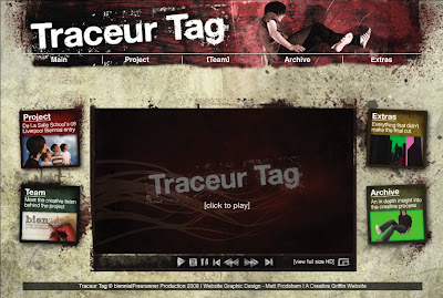.jpg)
Click image to enlarge
Team: The page looks great, but another row needs to be added to accommodate Jose and the others. Jose's block will contain some simple overview. The other block will just be a list of names. This is obviously just a mock up, spaces and box sizes will need manipulating to make the layout still work. Jose's box may be better at 2 columns wide, with the other 3 columns.
.jpg)
Click image to enlarge
---------------------------------------------------
The Site Structure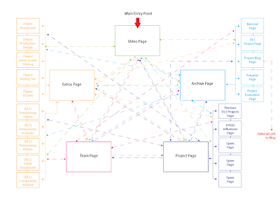
Click to enlarge
As you can see from above there are quite a few pages. Each section's pages are based upon sets of five. The
Extras page has 2 sets of 5 pages; 1 set for DLS and 1 set for the Team. Every page will be accessed from drop-down menus so this means every page will be accessible from every page.
---------------------------------------------------
Project Page
This is essentially the existing Team page without the other row.
---------------------------------------------------
Extras PageThe main extras page needs to have 10 links (see diagram above). There are 5 extras from De La Salle and 5 from the Team. That's 10 pages using the layout below. On the main page use the little boxes from the main page as containers to introduce each page. At this stage don't you worry about the wording. Just supply the PSD file with text layers unrendered and I'll fill them in later.
 Extras Sub-pages
---------------------------------------------------
Archive Page range of page layouts
Using the 5-column grid layout for this section can you supply a visible grid upon which I can work with Alan to place the content. These sketches are just some combinations on how the grid can be used to make the pages interesting.

---------------------------------------------------
Email me if the above isn't clear and I'll expand Matt. Use the
lorem ipsem body text for now so that I can get an indication of how many words are needed per text box. Any long pieces of text will be made into downloaded PDF files.


.jpg)
.jpg)


.jpg)
.jpg)


