Monday, 1 September 2008

What's the opposite of somnambulist? Well it's 4am and I'm IT right now.

Yo all,

End of my summer leave and it's back to work in 5 hours and you've guessed it… I can't sleep 'cos my body clock is screwed! Never mind here are some screen shots of rendered scenes from the final video. They still need Dave Bentick's skilful post-production colour manipulation but they are looking really good with Jose Flores' emotive skies in place behind Stas Krakiewicz's fantastic 3D set designs.

The last push to complete the post-production is here. It's been a hard slog but we're nearly there guys!


Wednesday, 27 August 2008

Launch night and DVDs

Hi Jo,

Just to clarify some points we discussed last Friday…

--------------------

FACT launch

Wednesday 29th October - can we get FACT to pencil that date in and we'll sort out the payment soon as possible? (see below)

--------------------

DVD authoring

I'll supply an authored DVD to duplicate. Can you ask for a quote for 250/500 DVDs and if they will be printed?

I have a quote from Matt's recommendation. Their price is:

Specification: 12cm DVD offset printed and duplicated
Qty: 500
Price: 79p per unit exe VAT
That is a total of £464.13 without P+P.

--------------------

Just on the price so far the cost for the venue and 500 DVDs will be £565, rounding up to £580 to cover P+P costs. That would be at least £290 to beg off each institution. At the very least we will need £50 each to hire the venue (the important cost).

What's your thoughts?

Dave Bentick... Business card

yo, do you want me to design a card for you so you have something cool to give out at the launch? I just spent a couple of hours doing one for myself and have found a good specialist printer online. Depending on if you want single or double sided it's between 15/25 per 100 and they have quite a few types of card to print on, I've ordered a sample pack. Just email me with the info you want on it (what would your general job title be?) and any ideas/imagery etc. if you want one doing. I won't charge you ;-p
cheers, matt


Thursday, 21 August 2008

Fact launch

Hi Dave,

Fact have been very supportive and are keen on having the launch there. Thay have two available dates - Wed 8th Oct or Wed 29th (earlier one may be best as the other one is the same week as the Biennial preview??)

There is a £100 charge for technical assistance and an usher, we could probably add this on to the dvd charge when we go hunting for funding. She will get back to me about the dvd price but she needs to know what format the film will it be in eg/ will it be mastered?

Also there is a young persons event next week showing District 13 and she asked if the lads would be interested so Im getting details from her and I'll post it up here so hopefully they will see it!

See you tomorrow.......

A little taster of the final digital sets

Here's some of the digital sets for the final film. A mix between Stas' fine 3D work and a little Photoshop art direction by me. They are full size and so watermarked to prevent any body in the future Knicking our IPR.


Wednesday, 20 August 2008

Last Couple

The extras sub-page now has a header, I already had this screen done though,


So I have completed:

[Main Template including all background tints, header, menu etc]
-Main Video Page
-Project Page + 5 sub page layouts
-Team Page + rollover states for each box/member (minus photos)
-Extras + Subpage template
-Archive (+ 5 layouts from projects)

Titles and credits are rendered at medium quality photo JPEG for editing so I'm set for handing everything over on friday

You took your eye off the detail!

Whilst you were pasting the layouts up on the building I think you missed something. Too busy focussing upon beermats eh! Pff!


Ok I've had enough Photoshop fun, now back to business… :-P

Good job so far. Here's my feedback…


Ensure all pages have page title. For sub-pages use the page title of the parent page.

1&2 - Cool. Just move Jo to the last box.

3 - Yep make the boxes shade difference a bit more obvious. Just move them all down a bit to add Extras page title.

4-end - The layouts are fine. No extra work needed here. Alan can now use them as a guide when coding.

Archive main page links - Good call, you've made me rethink this page. Use the video page layout replacing the player with a text box. Re-use the info box layout but limit the colour to one consistent tone based upon the page colour. In the box, we will place a page title and a one sentence summary. (rough the copy for now). Image wise just put in some placeholders. Maybe a PDF icon will do for now.

Extras subpages with a video box and thumbs underneath - you're nearly there.

I think that's all. Let me know if I'm not clear. Back to my tightrope walking!

Tuesday, 19 August 2008

Pff, beermats

Look where I drew these layouts up! Luckily my experience in manchester allowed me to get a pretty good straight on shot so you can see without flying to NY.


1&2 - Not sorted the images for the un-rolled-over boxes
, probably wait til I've got everyone's and do it in one batch so all the treatment's the same
3 - think this looks ok, might make the boxes shade difference a bit more obvious
4-end - some layouts for project & archive sub pages, was pretty liberal with the grid as the thing as a whole is so wide but the columns are so narrow. I think they're a good start, once you have the content I'm sure you can tweak them to fit better.


Let us know about the Archive main page in terms of links.
I'll knock up a layout for the extras subpages with a video box and thumbs underneath and then I think I'm nearly done!

Two can play at that game


I think the pages in red are the only physical pages that need laying out by me, it'll probably be less confusing if you duplicate the relevant pages once you have the document and re title them etc. incase any changes are made to master layouts for the sub pages.

One last thing I'm unsure of, links from the main archive page to the individual sub pages... are there any or is just from the drop down nav menu? if there are links on the page itself what format would be best? Boxes above/below the content similar to the 'extras' boxes with rollover images as to what's inside?

Credits

I think rendering lossless for editing was a daft idea ha, I started it going last night and it informed me that the file would be bigger than my hard drive! so I just rendered it as photo JPEG codec overnight and got it to under 2 GB. What codec will you use for the final version? If you need it lossless/animation I can just render it out to an external once everything's finalised but at this point it's a lot of space for a placeholder, I know this isn't that important now, just letting you know that everything's ready for friday, I'll render out a 1080 version of the titles tonight with the same compression incase any changes need to made to that before the final cut.

Monday, 18 August 2008

Charmin' doodles

Hi Matt,

Hope this clarifies things more...

Project page - will there be content in the three spare boxes eventually?

Thanks for bringing this bit up as this is certainly something I forgot to state. Each of the boxes on this page will feature, like on the team page,a brief profile of the DLS crew. 1 box for each lad (alphabetically I think) and the last for Jo. (Take the lads photos from the roof top shot where they're all standing together and you can get Jo's on Friday.) Links to the sub-pages will be available from the dropdown menu and as hyper links in the initial text introduction. The lads (being only 14) wont have any links but a quote about freerunning. Again lorem ipsum this bit.

Jo is writing the content for the 5 sub-pages and I didn't write down the working titles. All 5 pages will have content but as explained (hopefully) above these are different to the main project page's boxes.

Yes I know that was some really important info. Whoops!

Project Sub pages - (see below)

These are the same as the archive page layouts.

Archive Page - Same layout as Team & Project?

I think for the main page layout it needs enough room for text to put this section into context so maybe this page needs to be like the 1st sketch on the right hand column of sketches (a 1-column image, 1 blank column and then text spanning 3-columns).

Archive sub pages - Do you just want a variety of grids with placeholder images and lorem ipsum? will these also apply to the project sub pages? How many variations? good old 5? :)

5 of the best I think. Yes these are the same as the project sub-pages. I didn't make that clear.

Extras main page - would this not be cleaner using the grey boxes from the team page rather than 10 very textured boxes? (could have 1 shade for SH and another for DLS)

I saw this as using a simpler form of those main page boxes, maybe not with so much angularity or edging. One row of 5 on top of the other. The top row would have one tonal variation for DLS whilst the Team row would have another. The header text in each box would be a simple title with a informative image chosen to appear inside it to sum up what will be seen. Try it with placeholder images and rough text. I'll add the content into the PSD file before giving it to Alan.

Extras sub pages - am I right in thinking most of these will be image galleries with a similar layout to the video page? Shall I just provide 2 template layouts: one for vid and one for images?

I think in this case only one template will be needed. Just include a row of thumbnail images below the screen area. Just so we can have them in case that's the way we want to do it, include a forward and back triangle like on the video controller. Alan has demonstrated a viewing method using code on his website I think we'll end up using. We may use the triangles, or not, but it's best to have them in the artwork just in case.

I think a linear check list of each page I actually need to would help me so I just go through and tick them off as I go through and keep the photoshop document organised.

That's a good suggestion and something I've used in the past myself. I won't be able to get on to that until tomorrow evening so in the meantime can you have a go at implementing my attempts at clarification above.

---------------------------------

Motion graphics

Did you listen to the track I e-mailed to you? I've managed to get all the credits running at a legible speed to fit in with the 4 mins(ish), there might be another couple of seconds added when we have the track info but I can just time remap the comp and shave them off again, spread across 40 odd layers of text you won't notice the extra speed so the time of the rough edit will be exactly the same.

I think its best to sort this out on Friday.

Do you just want lossless QT files of the titles and credits?
If you mean for Friday yes that would be fine.

Thanks for keeping me on my toes :-) If in doubt use placeholders and lorem text. I will have to do a lot of the finishing off myself before giving the PSDs to Alan. As you'll find on future (paid) jobs the client (me in this case) hasn't got their act together and is making it up as they go along. '-) Clients eh? Bastards!

Nice loo roll doodles...

There are a few bits I'm unsure of...

Project page - will there be content in the three spare boxes eventually?

Project Sub pages - (see below)

Archive Page - Same layout as Team & Project?

Archive sub pages - Do you just want a variety of grids with placeholder images and lorem ipsum? will these also apply to the project sub pages? How many variations? good old 5? :)

Extras main page - would this not be cleaner using the grey boxes from the team page rather than 10 very textured boxes? (could have 1 shade for SH and another for DLS)

Extras sub pages - am I right in thinking most of these will be image galleries with a similar layout to the video page? Shall I just provide 2 template layouts: one for vid and one for images?

I think a linear check list of each page I actually need to would help me so I just go through and tick them off as I go through and keep the photoshop document organised.

---------------------------------

Motion graphics

The credits are as finished as I'm going to bother with until everything including scoring is locked down, so I can render out the sequence with white fade at the start and black at the end for editing purposes then just swap it out when I have all the info.

Did you listen to the track I e-mailed to you? I've managed to get all the credits running at a legible speed to fit in with the 4 mins(ish), there might be another couple of seconds added when we have the track info but I can just time remap the comp and shave them off again, spread across 40 odd layers of text you won't notice the extra speed so the time of the rough edit will be exactly the same.

Do you just want losless QT files of the titles and credits? Don't forget to bring an external drive or make sure your macbook has plenty of space on friday, I think there's going to be about 5 or 6GB of stuff including the sfx

Sunday, 17 August 2008

Website structure diagrams and alterations

Hi Matt,

Here's the alterations I mentioned, mostly superficial.

The main changes I'd like made to the design is to the links and adding another row to the team page.

---------------------------------------------------

Links: Where you've moved the links up to the banner as I suggested, the next step needed is to remove the boxes so that they integrate into the logo masthead. The edges can be now indicated by simple white lines. The bottom edge will have to be increased to accommodate the text. The text colour doesn't have to white.

[Alan these links will also need to drop down into menus to accommodate the sections pages.]
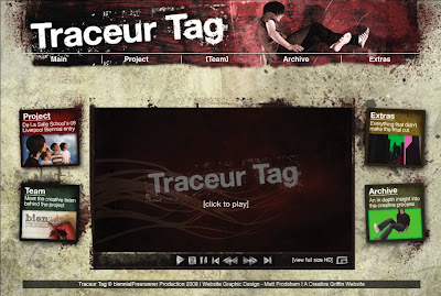


Click image to enlarge

Team: The page looks great, but another row needs to be added to accommodate Jose and the others. Jose's block will contain some simple overview. The other block will just be a list of names. This is obviously just a mock up, spaces and box sizes will need manipulating to make the layout still work. Jose's box may be better at 2 columns wide, with the other 3 columns.


Click image to enlarge


---------------------------------------------------

The Site Structure
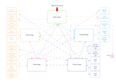

Click to enlarge

As you can see from above there are quite a few pages. Each section's pages are based upon sets of five. The Extras page has 2 sets of 5 pages; 1 set for DLS and 1 set for the Team. Every page will be accessed from drop-down menus so this means every page will be accessible from every page.

---------------------------------------------------

Project Page

This is essentially the existing Team page without the other row.

---------------------------------------------------

Extras Page

The main extras page needs to have 10 links (see diagram above). There are 5 extras from De La Salle and 5 from the Team. That's 10 pages using the layout below. On the main page use the little boxes from the main page as containers to introduce each page. At this stage don't you worry about the wording. Just supply the PSD file with text layers unrendered and I'll fill them in later.


Extras Sub-pages


---------------------------------------------------

Archive Page
range of page layouts

Using the 5-column grid layout for this section can you supply a visible grid upon which I can work with Alan to place the content. These sketches are just some combinations on how the grid can be used to make the pages interesting.


---------------------------------------------------

Email me if the above isn't clear and I'll expand Matt. Use the lorem ipsem body text for now so that I can get an indication of how many words are needed per text box. Any long pieces of text will be made into downloaded PDF files.

Wednesday, 13 August 2008

School Logos

Just about to embark properly on the credits and find out if it's a couple of hours job like I think and hope it will be or if it's going to be a couple of days.

Anyway, can I get a vector/huge res raster of the college and school logos for the end?
Can you sort that out please dave?

Just been through the list of credits, lo and behold there's 5 sections! (except for the small print stuff at the end which I'm just going to crawl up as opposed to the diagonal scrolls) when will it end? needless to say, the colours will make a final appearance

cheers, matt

Web update

Thought I'd get these out the way today then I can just do a bit of relaxing illustration for the band on friday when I'm hung over :)

1) Tried incorporating the menu into the header, i think it could work if I spent a bit longer sorting it out, but you'd lose the hints of the coloured zones once you navigate away from the main page with the splash images on.


2)
Shifted the oringal menu up and the content down to give a bit of breathing room, the height of the image is 700px, and I think we have a bit of leeway with that anyway don't we? Sorted the type out on this one, the only thing I had to slightly change was 'De La Salle School's 08 Liverpool Biennial entry' (the 08 has moved before LivBi instead of after) just to fit within 2 lines. I've changed the placeholder image to one of the rough end scenes


3)
I think there's plenty of room within the one page to write a quick bio and details, then have some images pop up with the text on rollover, I think having all the info there at the same time will be a bit much - wall of text.
The course/job info would be there all the time but I don't have that info yet, that can be added later.
Any chance Dave B's could just be post-production to keep the typography nice? I think this page can stay contained and quite compact rather than have individual profile pages, what do you reckon? I can't think of too much more info that would be necessary, if people (me) don't have websites but have a pdf potfolio, could clicking the box result in a download of that as opposed to opening a site?


cheers matt

Tuesday, 12 August 2008

Editing Meeting

Hi Mrs. Jo,

Glad to have you back :-)

Wed, Thursday or Friday next week would be perfect for the editing in FACT. Dave can you confirm which day would be good for you too.

If your free this week or early next week I could do with a meet to discuss the other bits of information RE: website, launch and biennial. I can come to ST Helens.

What do you think?

Website Feedback

Hi Matt,

Good job. You've achieved what was in my head (no mean fete) and in places excelled it. I've added my initial comments (not cryptic :-P) to the images. On Friday if you can amend the visuals and upload them I'll advise further. Jo is now back so I can arrange to sit down with her to discuss the content. A pleasure to work with you!


Click image to enlarge and read


Click image to enlarge and read

Web layouts


Tried to keep it fairly simple for now, I suppose once you get past the main page it just needs to communicate a barrage of info so I wanted to strip back the grunge for those pages. Hopefully you can see the huge impact just a subtle hue shift does to the overall feel of the page, I tried altering the header colour too but it's a bit harsh when swapping between, the deep red works with all the colours anyway as they're so desaturated. All the text apart from the header and the titles in the coloured squares (the 4 other zones) is just in Helvetica.

The buttons etc. on the video were just scibbles, they actually look quite cool hand drawn so I might develop some proper ones depending on everyone's thoughts.

I just did 5 team members so it fit in with the 5 columns up top but this doesn't matter too much when we start adding more people. I thought it would add a bit of interactivity if the team members faces only swapped in as you hovered over the name, keeps the page looking clean too. We'll need to take some piccys at some point, so to all who it applies get your hair cut ;-)
Dave when you sort the content out make sure you include titles for the team member page as a lot of people have multiple job roles in the credits, I just had an educated guess for you and Stas

So... leave me lots of crit and comments and I'll pick it up again on friday - not too cryptic mr wood, busy week this week :)

Nice day isn't it?

-matt

Saturday, 9 August 2008

Website meeting notes

Matt, Alan and I met today to discuss the website that we are designing to support and market the completed video.

Timeline for completion will be an end of August deadline.

We have decided upon a 5-zone site, split into the following:

  • Main zone - viewable web version of video with surrounding content linking to other zoned content areas. Up until the actual unveiling of the video we will only tease the viewer.
  • Project zone - this area will set the video into it's project context (Jo I'll discuss the content for this area with you as this area should focus on you and the lads)
  • Extras zone - this zone will have additional support material that didn't go into the main video e.g. footage of the lads freerunning, an interactive walkaround of the final scene, concept illustrations, storyboard, animatic, pre-viz tests, narrative tests, etc.
  • Team zone - this is the area for the St Helens team to shine. A mix of bios, promotion and links to work they did on the project
  • Archive zone - this is a more academic zone where the project is recorded as academic research. The project blog (after editing of IPR material) will be made public and available through the website. This section will also have content added to aid marketing of the video.


2 main points for consideration we discussed that needs researching are:

  • Code to detect users connection speed to load relevant video page
  • Option in Flash to toggle video to full screen mode


Visually the site will reflect the graphic design decisions Matt has so ably designed so far. Matt will re-use and re-purpose the intro credits background, blog logo and visuals into a design for the website and plans to have some visuals on the blog for next Tuesday. The 5-part tonal colouring of the video will be subtly reflected within the website design with each zone taking a different tone. The blog logo will also be varied for each section using a different lad's image (Matt the archive section can duplicate the video page logo. Alan from Creative Griffin will build the site at the end of August. I will be responsible for the art direction of the website, and the information architecture and content.

From the website design I will then re-purpose it to build a DVD master ready for the launch.

I think I've covered everything but Matt and Alan will let me know if I've forgotten anything?

Thursday, 7 August 2008

August Update

Just thought I'd keep everyone informed of the progress so far considering there's been a hiatus in posting.

We are in the last stage of the project - post-production.

Dave Bentick is doing the job of 10 in keying out the High Definition footage to a very high standard.

Matt Frodsham is working on the end credits and is about to start the graphic design on the website and DVD.

Stas Krakiewicz is completing the digital sets and working on the digital camera shots we need.

Dave Wood is coordinating the final shots, working on the art direction of the overall video's aesthetic, designing the interactive archiving of the project on web and DVD, and other odd jobs.

-----------------------------------

Upcoming Meetings

-----------------------------------

Web team meeting - Saturday 9th August in FACT Bar at 2:00pm

Meeting between Dave Wood, Matt Frodsham & Alan Bridge of Creative Griffin

  • Dave Wood - Information Architecture and Art Direction
  • Matt Frodsham - Graphic Design
  • Alan Bridge - Website design and development


-----------------------------------

Rough Editing of video meeting - in FACT Date and time TBC

Meeting between Dave Wood, Dave Bentick & Jo Millea

Jo can you confirm when you're free? Congratulations from the team on your recent marriage :-D

That's it for now.

Ciao

Tuesday, 29 July 2008

HD title sequence

I've uploaded a hi def version on vimeo so everyone can see what's going on. It's got a bit more punch now, added a more impact to the logo flying in, and the flashes are more organic and erm, flashy. The colour shifts at the end are there subtley, the end poem still probably needs a bit of tweaking at a later date when I've had some time away from it but the main bulk's done now anyway.


Traceur Tag HD titles v.2 from Matt Frodsham on Vimeo.

You can watch the small preview there^^^^ or you can click the link and watch it in HD (recommended, if not only because it's been uploading in the background for about 4 hours)


I'm about a third of the way through 'acquiring' the SFX, from the file names there looks like some great ones - heart beats, crashes, swooshes, ambient, abstract, build ups, explosive impact, rumble etc. so we should be pretty much sorted. The only thing we might have to record is the footsteps and the breathing, but that's not too far fetched.

Has there been any progress on the music front? Something that occurred to me is we haven't discussed any music for the end credits? (Not classical guitar before anyone suggests it!) Are we going to stick with electro music and have something more laid back and organic (check out 'four tet' for some examples of what I'm thinking), that way there wouldn't be a jarring contrast in the music but enough not to want to buy some speed after the high adrenaline drum n bass carried on for 5 minutes of credits haha.

Suppose I should get on with some proper work

-matt

Friday, 25 July 2008

Narrative Test from C-Z

Here it is folks the first full (well nearly full) narrative test.

All sets are placeholders, all footage is rough and low-res, and obstacles are just placeholders.

Remember this is NOT exactly how the final video will look, it will be better. Enjoy!


On agreement amongst the production team at the last full production meeting, the video will be colour-corrected in 5 themes:

Opening roof top scene - naturalistic lighting
Meteor strike run across and down building exterior - red colouring
Interior of building - desaturated colour (bluish)
Fire Exit escape and 2nd building escape - sepia palette
End tag scene - return to naturalistic light

These 5 sequential palettes of colour can then be subtly used in the opening credits of the video behind the poem. The poem words are to be re-paced with a rhythm that reflects the final pace of the film.

Matt/Dave is that summary agreeable?

Credit List update

Can everyone check and amend the credit list so we can sign it off for Matt to design the end credits.


Cast

The Freerunners:

Dominic Andrew
Matthew Fitzhenry
Aaron Ross
Phillip Smith


Story
Dominic Andrew
Matthew Fitzhenry
Aaron Ross
Phillip Smith


Directors
Adam Hamilton & Dave Wood

Producers
Dave Wood & Joanne Millea

----------------------------

Pre-production

----------------------------

Art Direction and Storyboards
Dave Wood

Concept Consultant
Joanne Millea

Conceptual Design
Matt Frodsham

3D Digital Set Concepts
Stas Krakiewicz

With the help of:

Jenny Swann
David Ball
Shaun Johnson


----------------------------

Production

----------------------------

Live Action

--

Camera Operators
Steve Webster & Adam Hamilton

Camera Grips
Mike Farrall & Andrew Sarsfield

Technician
Nikki Rose from Toxteth TV

Freerunner Supervisor
David Ball

-----

CGI

--

Lead 3D Digital Set Modeller
Stas Krakiewicz

3D Asset Creation
Mike van de Waal
Robert Hannah


-----

3D Animation

--

Fire Escape Collapse
licensed from
Chris Hopley

Meteor
licensed from
Jose Flores

Graphic Design
Matt Frodsham

----------------------------

Post-Production

----------------------------

Lead Rotoscope and Video Compositor
Dave Bentick

Assistant Rotoscoper
Matt Frodsham

Visual Effects
Dave Bentick
Jose Flores


Editor
Adam Hamilton

Assistant Editors
Dave Wood
Joanne Millea
Dave Bentick


Original Music
TBC

Traceur Poem
licensed from
Casey Kandel

Interactive Archiving
Dave Wood
Matt Frodsham
&
Alan Bridge of Creative Griffin


----------------------------

Resources

----------------------------

Props
De La Salle School

Camera Equipment
St Helens College's Media Centre

Green Screen Facility
Toxteth TV

----------------------------

Thanks to

Sarah Jones
Stan Millea

----------------------------

This project was achieved through the collaboration between
De La Salle School's art department
and the creative students from
St Helens College's undergraduate degrees:

BA(Hons) Entertainment Media Design
FdA Computer Game Design
FdA Graphic Design

and graduates from:

BA(Hons) Digital Arts
BA(Hons) TV Production
FD Interactive Multimedia

----------------------------

Supported by funding from
Liverpool Biennial 2008

A biennialFreerunner Production
Licensed to De La Salle School/St Helens College
© 2008 All rights reserved.

../add school and college logo/..

Tuesday, 22 July 2008

Result

Hi Matt,

Very well done!!! If you don't already realise it you have achieved a result some professionals strive for. To animate an established logo (without permission) and then get the green light is a BIG achievement. Very professionally handled, I'm proud of you!

Keep that professionalism going and you'll go far.

winner

Date: Tue, 22 Jul 2008 17:27:51 +0100
Subject: Re: biennial logo for project
From: jennifer@biennial.com
To: froj2002@hotmail.com

Hi Matthew -

If this is not already confirmed – this is fine, it looks great!

Kindest

Jennifer

------------------------

I'll have to get on to selling it to them now they like it haha, hmm

-matt

Sunday, 20 July 2008

HD titles test 1


I'm going to leave it for a while, get some crit & return with fresh eyes, maybe wait until after meeting on friday to do any more to it. I want to add a bit of camera shake when 'Traceur Tag' first appears to add a bit more impact and dynamism but apart from that I think it's coming together.

ps. Rendering tip I just got from mograph.net:

If HD is playing really REALLY choppy in QT for you like it was me, render out your AE files with 'photo jpeg' compression rather than the default lossless animation, looks great and plays really smooth.

-matt

pps. Stas I just got a ton of free vectors with computer arts projects, including a plethora of warning signs you might find useful...

Saturday, 19 July 2008

biennialfreerunner logo animation

*deleted vid to save loading too many on blog, see above for the improved version along with a test of the whole intro*

I think it looks pretty nice, worked like I imagined it would, I just need to fine tune the white balance and levels as a few frames are a bit too dark, bloody weather kept changing while I was doing it. I like the flickering though as it adds to the diy aesthetic.

Don't worry, you can actually read everything on the proper render.

Exam and first day of placement went well so I'm back at full force now. I'm waiting for a reply from Jen from biennial regarding the logo but I'll get on with the titles anyway as planned and just swap it out for the 2D logo if they have a problem with it.

-matt

Wednesday, 16 July 2008

logo legality

Dave, see below for the contact so far regarding the biennial logo. Shall I just send her the video or are there any comments you would like to add regarding where it will be shown etc?
cheers

...........................................................................


It depends where it’s going to be shown you see, there are all these brand guidelines that ‘we must adhere to’! If I could see it, that’d be great


Kindest
Jen


On 16/7/08 17:18, "Matthew Frodsham" wrote:

Thanks very much that's great,

I'm going to be creating a short 3D animation to add a bit of motion to the logo as the biennial is credited at the beginning of the film before the title sequence. The project leader has suggested we run it past you to get clearance before we use it in the final edit.
The colours, shapes and font will all be accurately replicated (which is why the larger logo is really useful)
Shall I e-mail you a preview of the render or is there anyone specific who would need to ok it?

Thanks again for your help

Matt


Date: Wed, 16 Jul 2008 14:23:22 +0100
Subject: Re: biennial logo for project
From: jennifer@biennial.com
To: froj2002@hotmail.com

Re: biennial logo for project Hi Matthew -

Please find attached the logo – eps is the highest res we have -

Hope that this is of use,

Kindest

Jen

Pickups Postponed

Hi Jo,

Just to let you know we will put the pickup filming on hold until the end of August/beginning of September if at all.

Adam is now really busy and I wouldn't trust anyone else at this stage to film the bits we may need. We can discuss the need for pickups when we do the rough edit at the beginning of August.

Adam is still up for getting involved at the end of August. We will have tons to do before then, so a final edit can be fairly safe to leave for then. We can get a score done based on the rough edit.

Cheers

biennialFreerunner logo sting mock ups *updated*


The fire escape scene below looks really good, coming together nicely.
I think the screens above give a decent example of what I'm thinking, obviously the contrast will be stronger, and throughout the fbf animation there'll be a lot of personality showing through the process: hands, pencils, rubber, ruler, coffee popping into shot every now and then etc. If it turns out how I'm thinking then it should look really nice, and if not it will only have taken about an hour anyway. Should do though.

Anyway, exam tomorrow so I'm going to stop clogging up the blog and return at the weekend
-matt

*EDIT: just had a response from Jen at Biennial with an eps attatchment of the logo, bit late but I suppose I'd best withdraw my slating of their service ;)
I'll email back a thanks then send my animation tomorrow to run it past them (make it look like I used the eps she sent)

Tuesday, 15 July 2008

2nd batch of pre-viz composite tests

Here are another batch of pre-viz composite tests:


------------------------------------------------------------------------------------------------------------------------------------------------------------------
Panel 9 - Roof Jump


------------------------------------------------------------------------------------------------------------------------------------------------------------------
Panel 27 - Fire Exit


------------------------------------------------------------------------------------------------------------------------------------------------------------------
Panel 30 - 2nd Building Roof Jump


------------------------------------------------------------------------------------------------------------------------------------------------------------------
Panel 31 - 2nd Building Drop 1


------------------------------------------------------------------------------------------------------------------------------------------------------------------
Panel 35-38 - End Street Scene


biennial logo v.2

biennial freerunner - team name?

I've had a nice idea for the production team logo/sting - basically hand drawn & rendered type (rockwell would be nice) with some technical drawing bits and bobs shot frame by frame (roughly) with a digital camera then animated very quickly through 3 secs. Show process and all that, I like that stuff. Will contrast nicely with the shiny biennial logo too and act as a transition to the titles. I'm off to town to get a cable shutter release now to save my sanity while I do it next week.

Anyway what should the official name be? production team sounds a bit stale, I think everyone's put more into it than that.

biennial freerunner - creative team?

I'll post a story board for the titles up thisafternoon if Dave W could check the order of things and the info's correct etc. before I start on that properly.

cheers, matt

*edit

Biennial logo sting

Need to drop the correct colour values from the logo on the site, sort out the lighting and fix the first camera move as it's a bit tight, but apart from that considering I don't know what I'm doing with 3d... it works at least! I'm currently acquiring a ton of royalty free stock (pre-matted!) footage of grungy things like ink bleeds, splatters, drops etc (Andrew Kramer's Riot Gear Dave B, have you got it? If not I'll sort you out next week with it, it's about 2.5GB) that will come in very handy for adding some movement and texture to the credits and titles.

If we're using 'biennialfreeunner' as the production team name I'll put together another sting using that name with different type etc. and change the current logo to say traceur tag and tighten it up now the title's finalised.

-matt

Monday, 14 July 2008

Sealegs


Biennial Logo

Just did a quick motion test to make sure I could do what I thought I could do in C4d (I can!) I'm sure you can see where I'm going with it: plinky plonky falling blocks, zoom out and swing round reveal the whole logo (which I'm probably going to have to trace seeing as the one reply I got from the biennial was an automatic 'I'm out for a couple weeks, here's some more people to annoy instead'). + reflective floor, some more lights and a dark grey BG rather than black and I think it'll look good enough for a 3 second sting. Better than just fading on and off in helvetica anyway.
This isn't a vid btw, just a screen grab of the the render preview

Some more signs (More to come)